Today, we spent the whole day filming as much of the footage for our music video as we possibly could. We did not succeed in fully completing all the filming we needed, and so we will have to go back on a later date to get the rest of the shots we require. However, we have more than enough to begin the editing process for now.
Myself and my group arranged to meet at Temple Meads at 9am, in order to allow us a good full day's worth of filming. We decided the weekend would be best to do this, as neither our group nor the actors would have had any educational commitments in the form of lessons it would be unfair to ask them to miss, and also the weekend is when everybody was most likely to be free. Filming in the morning was also important for us, as our initial shots are morning shots, and reply on the use of natural light to convey the time to the audience. If we were filming perhaps later in the afternoon, when it was forecast to be slightly sunnier, then this could affect the portrayal of morning that we wanted to convey, and create a negative impression on the audiences perception of our product, as they perhaps would not understand the narrative.
We met as a group first, in order to establish that we had everything we needed - in terms of equipment, props and storyboards etc. We then met with the actors and travelled together to Kuda's house to shoot our interior scenes.
We felt that for ease in the editing process it would be more efficient to shoot in storyboard and narrative order. This should theoretically make editing more straightforward in that we hopefully won't have shots all over the place, and they will be in an easily accessible order. This therefore meant that the first scene we required the actors to do was to get into bed with each other...

After the initial awkwardness of the first scene, the two seemed to act quite comfortably together, which we felt would help to enhance the feeling of realism we aim to achieve in our representation.
We used framing here to represent the emotional detachment between the couple. Whilst they were lying in bed, we wanted the closeup shots to be framed heavily-weighted to one side, surrounding the character with empty space in the frame, in reflection of the vast amount of space between the couple on an emotional as well as physical basis. This was something we then emphasised with an overhead mid-shot of the two in bed, where each was positioned as far from their opposing sides of the frame as possible, showing a clear physical divide between the two, which connotes the status of their relationship.
Setting up for these scenes took much longer than we had imagined, but this showed us what to expect for the rest of the filming period, allowing us to factor this in to the time management for the remainder of the day.
Kuda's room was quite small and with 5 people in it, the room became quite cramped. There was not a massive deal of room for manoeuvre, and so we had to be quite experimental and creative with the angles and shots we chose. One problem we encountered was the natural light from outside, which kept fluctuating from brightness to darkness due to the cloudy weather. This affected the continuity of the shots, and meant that we had to shoot double the amount we had expected to try and get a range of clips that would enable us to create a running visual theme, instead of a disruptive, constantly changing visual flow between shots.

Additionally, as the natural light from the window was the only lighting source we used, we had to be very careful in the positioning of ourselves and the camera, so as not to cast any shadows across the scene. This meant that we took a number of unconventional filming approaches into obtaining the angling we needed, including placing the tripod above the actors in the bed, and also holding it out to create an overhead mid-shot of the two together. The only way in which we could effectively achieve this was to sit at the foot of the bed, with all three of us holding the end of the tripod in order to get as steady a shot as possible. Obviously, this was going to affect the outcome of the shot, as it would not ensure complete stability, but it would make for a smoother visual style than a simple hand held shot might have done.

We filmed a few brief shots of the mise-en-scene that we brought, but I feel that we are unlikely to use them as there was nowhere they could be positioned to be simply seen in the background, and quick pan across them may look odd and out of context.
We then went into the dining room to film the second set of interior shots. This was fairly easy to set up, as we had already seen the location through images Kuda had shown us, and upon entering the house, so we had a rough idea of the camera set up we wanted to use. Additionally, there was much more room for movement whilst filming, so we were able to get a wider variety of camera angles and positions. Seeing as we had three cameras, we thought it would be best to have at least one set up in a static, long to mid shot setting,in order to allow a steady and clear depiction of the narrative. We used the remaining two cameras to gain alternative angles and perspectives, focusing on one character each. This would enable us to create a range of camera effects in the editing stages, such as that of the shot-reverse-shot between the two characters, and match-on-action's, for example, when the glass of juice is passed across the table. In the modern day, main narrative to the video, we opted for the use of more high angles shots, to show a more powerless and weaker position, in order to reflect the state of the relationship that we wanted to convey. It makes the two seem as though they have no power to change anything within the relationship, and they are emotionally sinking together. In the happier flashbacks, we made a point to capture many of the shots from a lower angle, looking up at the two actors. This heightens a feeling of authority and power, perhaps suggesting that they are on top of their relationship and in total control - it is unfolding as they want it to, and they are both of a mutual level of respect and understanding in the relationship.
One problem that we encountered during this part of the filming process was again with the lighting in scenes, particularly that of the flashback. We wanted this scene to come across as romantic and intimate, and were hoping to achieve this through the use of low-key lighting in the form of candles. However, when we began to film like this, we noticed that the shots were far too dark, and the camera wasn't picking up any images in great quality. We tried to resolve this by opening the curtains behind us slightly, in order to filter a small amount of light in to act as a front light, allowing the camera to pick up the image. However, the natural light was too powerful, and completely overturned the lighting from the candles. Additionally, as we framed the shot with a window separating the two, and were filming during the day, the only way to block out this light was to pull the curtain across it. However, this failed to stop the light from seeping through the edges of the curtain and ruing the effect of the shot. We overcame this slightly by placing the lid of the Scrabble box against the curtain to hold it down, but unfortunately it was ultimately unavoidable. We set about trying to find a range of different shots to avoid seeing the lighting, usually using close ups that focused more on the face or action at hand.
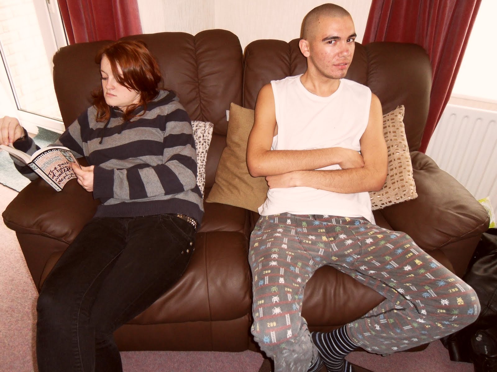
Whilst we were filming, we also thought it would be beneficial to hold various photoshoots at the same time. These images could then be used for our ancillary products of the magazine advert and the CD digipack. By taking images simultaneous to our filming, it would create cohesion between the images, as the factors of the images would all be the same, in terms of location, appearance, lighting etc. This is an important thing to consider when thinking about the synergy we need to create through our digipack, in order for it to work together as a whole promotional tool.
These are some of the images we captured. Although we did not make any plans for any images of this sort, we thought it would be beneficial to us to get as wide a range of images as possible, whether planned or impromptu like these were.


We then left the interior location, and walked to a park close to Kuda's house. The weather was pretty miserable by this point, which could have worked well in terms of the connotations of misery we were aiming to portray in the narrative, but overall we felt that it would be better to come back and film more exterior shots another day. Unfortunately, due to the extensive amount of filming we had done all day, the cameras were nearly flat, and so we did not have much filming time left as it was. We managed to film a fair number of exterior shots in this location, before it started to rain, so it may even be the case that we have enough of the modern day narrative strand as it is. We will definitely need to arrange another day to film the exterior flashback scenes, hopefully on a day with a more desirable weather forecast.
 Technology was a crucial usage throughout the evaluation stages of this coursework. Firstly, the main use of technology was in the form of Blogspot, in order to present my findings and my evaluation in a clear and coherent form. This was a relatively straightforward process as it is the medium we have used and become incredibly familiar with over the duration of the coursework period, and we also used it as the medium for presenting our AS coursework in much the same manner, so it was a programme I knew well. It allows you to display information in a wide variety
  of formats and structures, therefore was incredibly useful for the wide range of media and research involved in this project.
 t amendments to our product that were needed in order to create the best overall product we could. We also used Kuda's blackberry camera as an alternative when there were no other cameras available. Although this meant a suffering in quality, we ruled that this wasn't too important as it was the content that mattered most, which was still fully accessible. We collated these clips using iMovie, which allowed us then to edit the footage together to
 review it, so we could then upload it onto YouTube, and embed the video in our blogs. This meant that we would have a point of reference when discussing the feedback we have received during evaluation question 3, and improved the variety of media content on our blogs.


